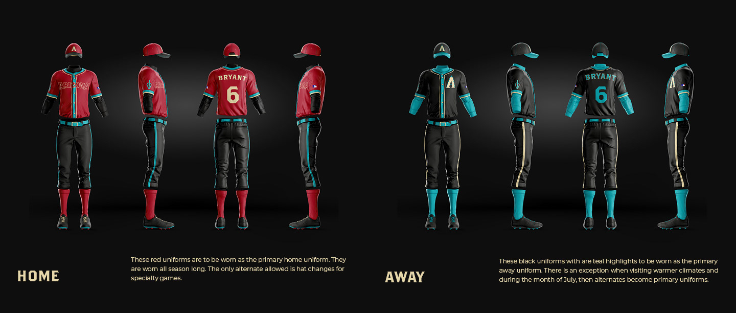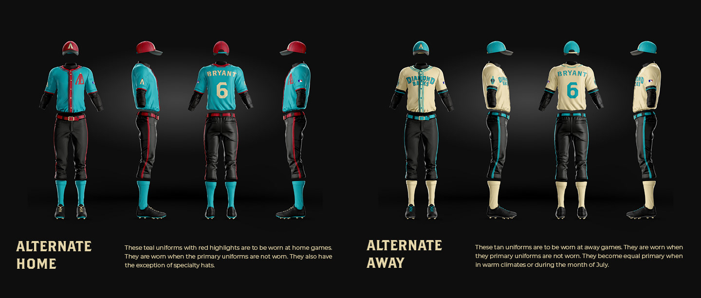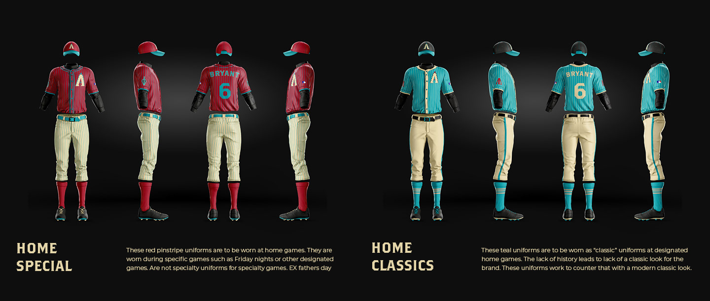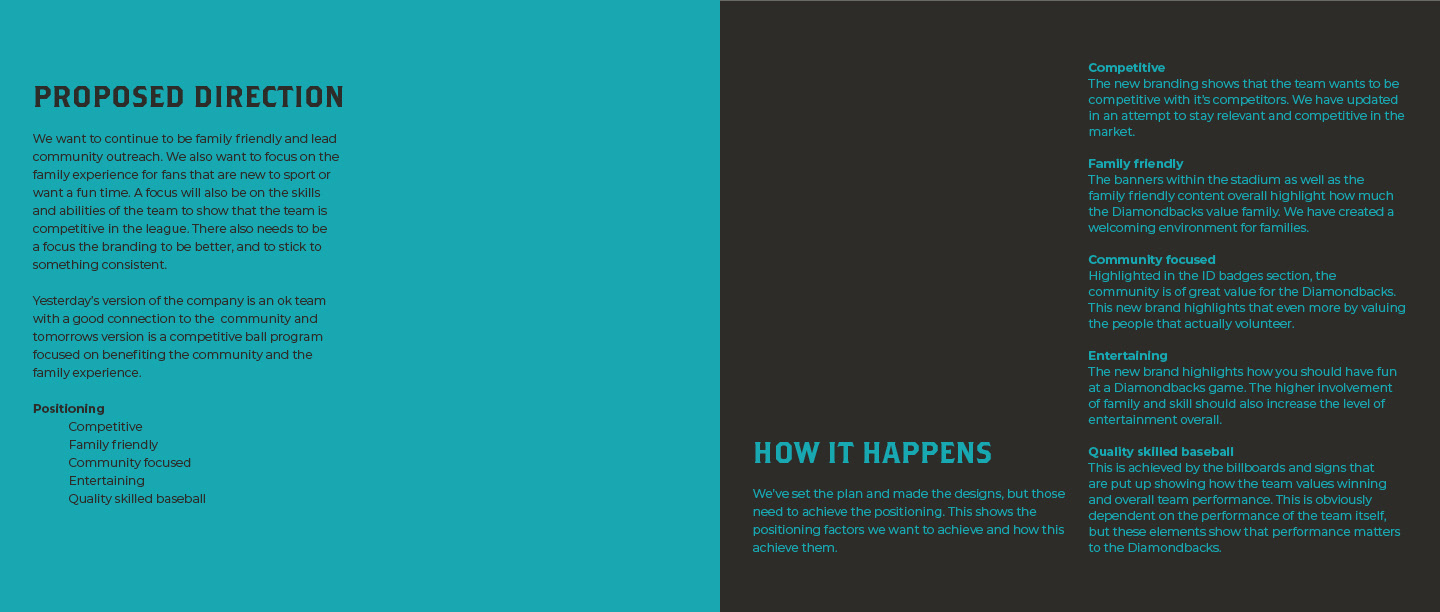
This project focused on rebranding the struggling Arizona Diamondbacks. The team has had steadily decreasing attendance numbers since their 2001 World Series Championship win. This was an effort to refresh the feel of the brand as well as bring people back to the Diamondbacks.
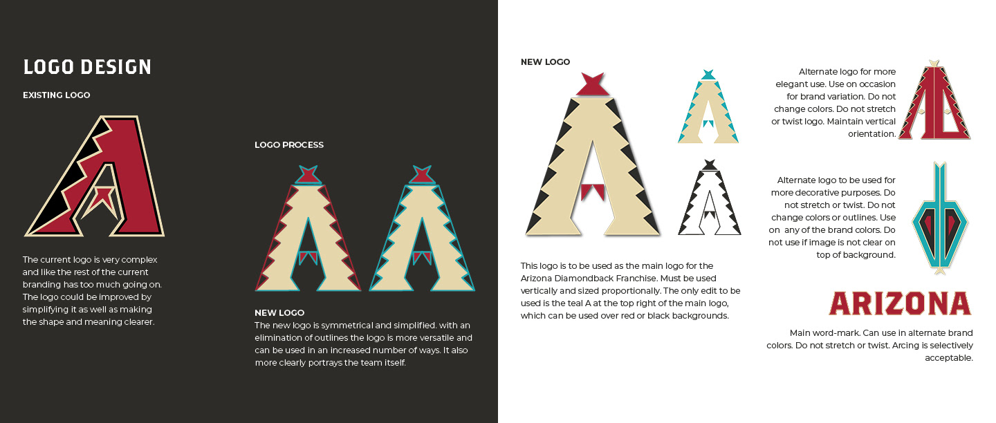
Above was the process of redesigning the logo for the Diamondbacks. Now it is much more simple with less outlines and stylistic features. You can also see the secondary logos that many be used on occasion.
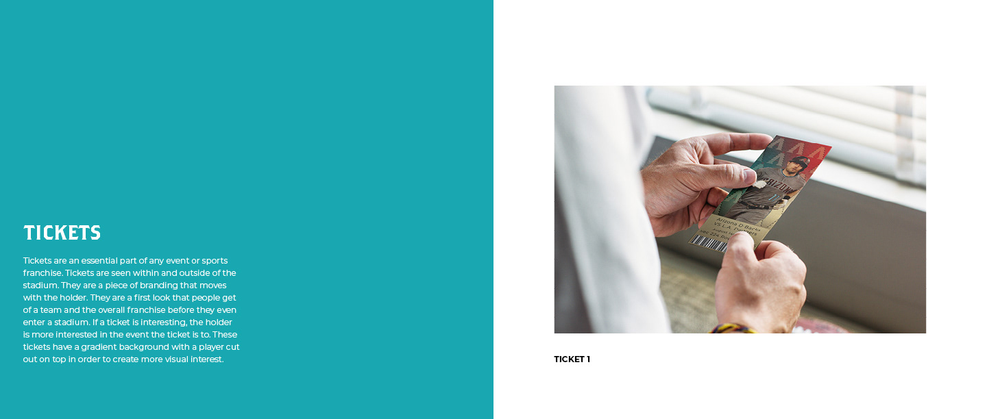
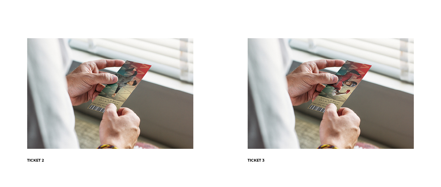
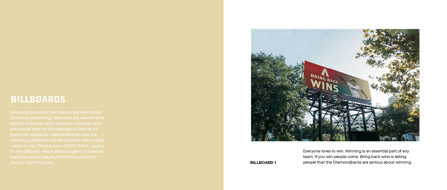
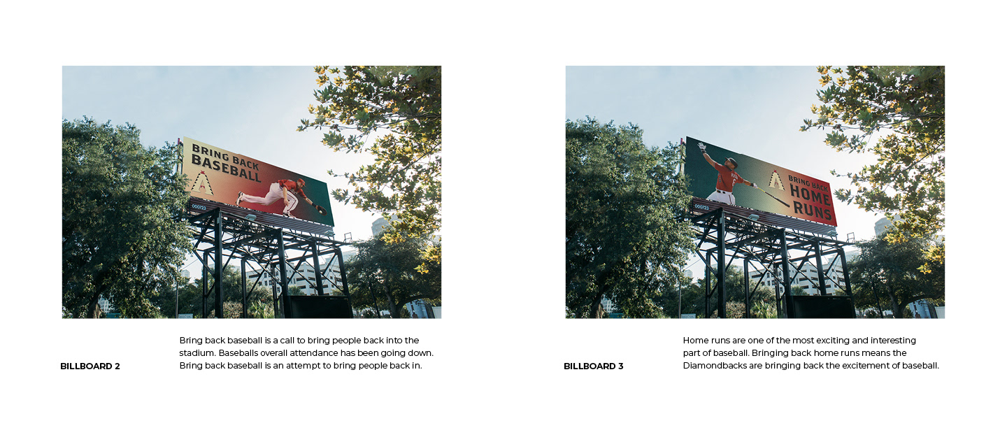
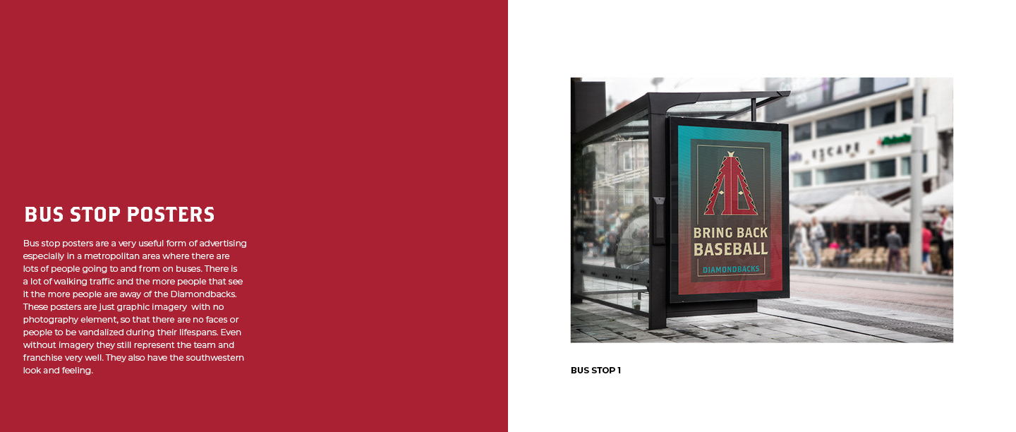
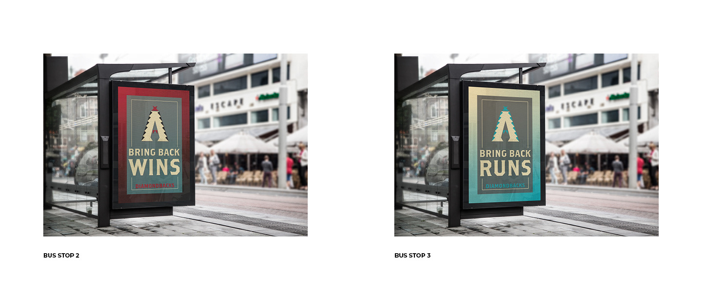
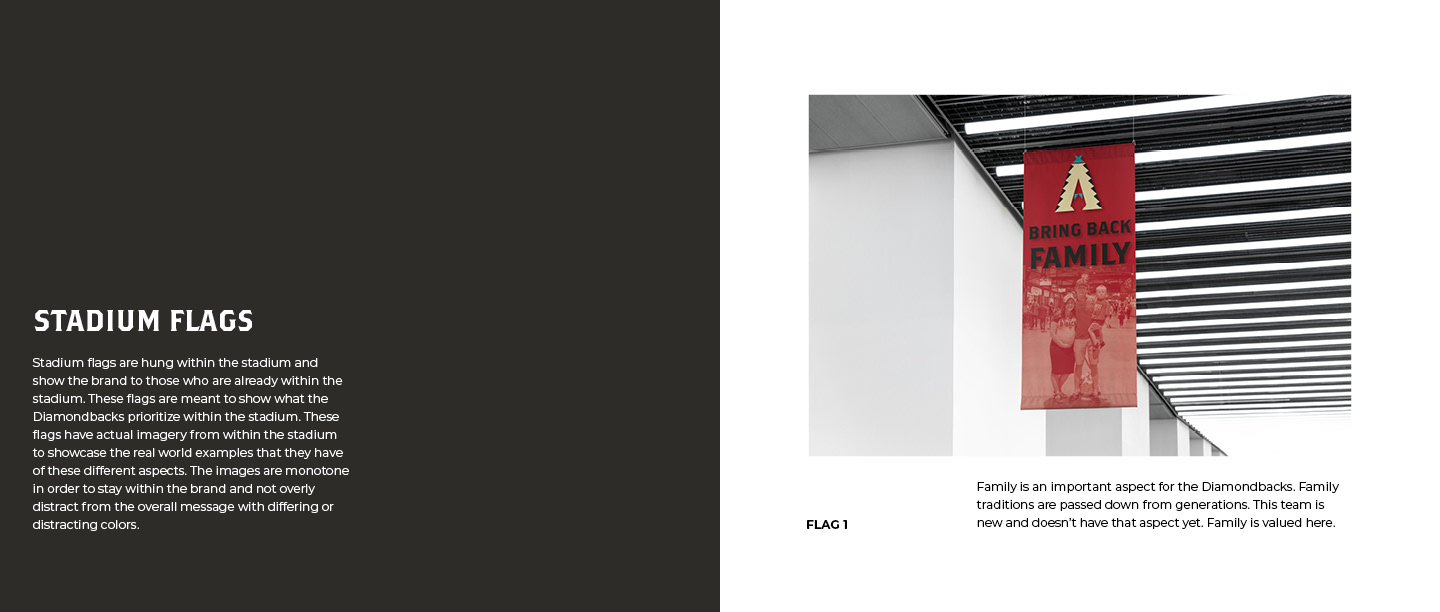
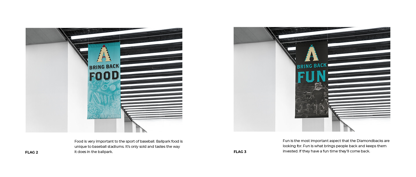
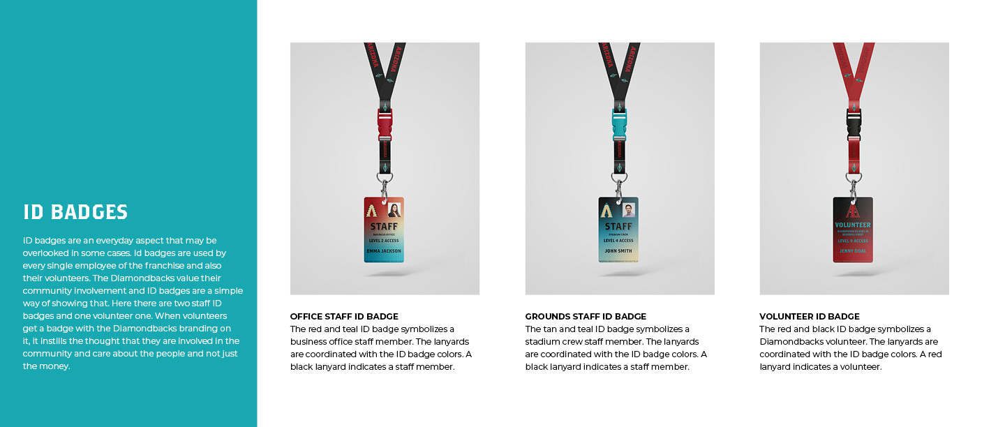
Below are some of the deliverables that came out of this rebrand and project. The goal was to create a feeling of a family friendly environment as well as to put an emphasis on how the Diamondbacks cared about the game of baseball itself. All of this was done in a fun, family friendly way that enhanced the southwestern feel of the team and the area.